What is a landing page?
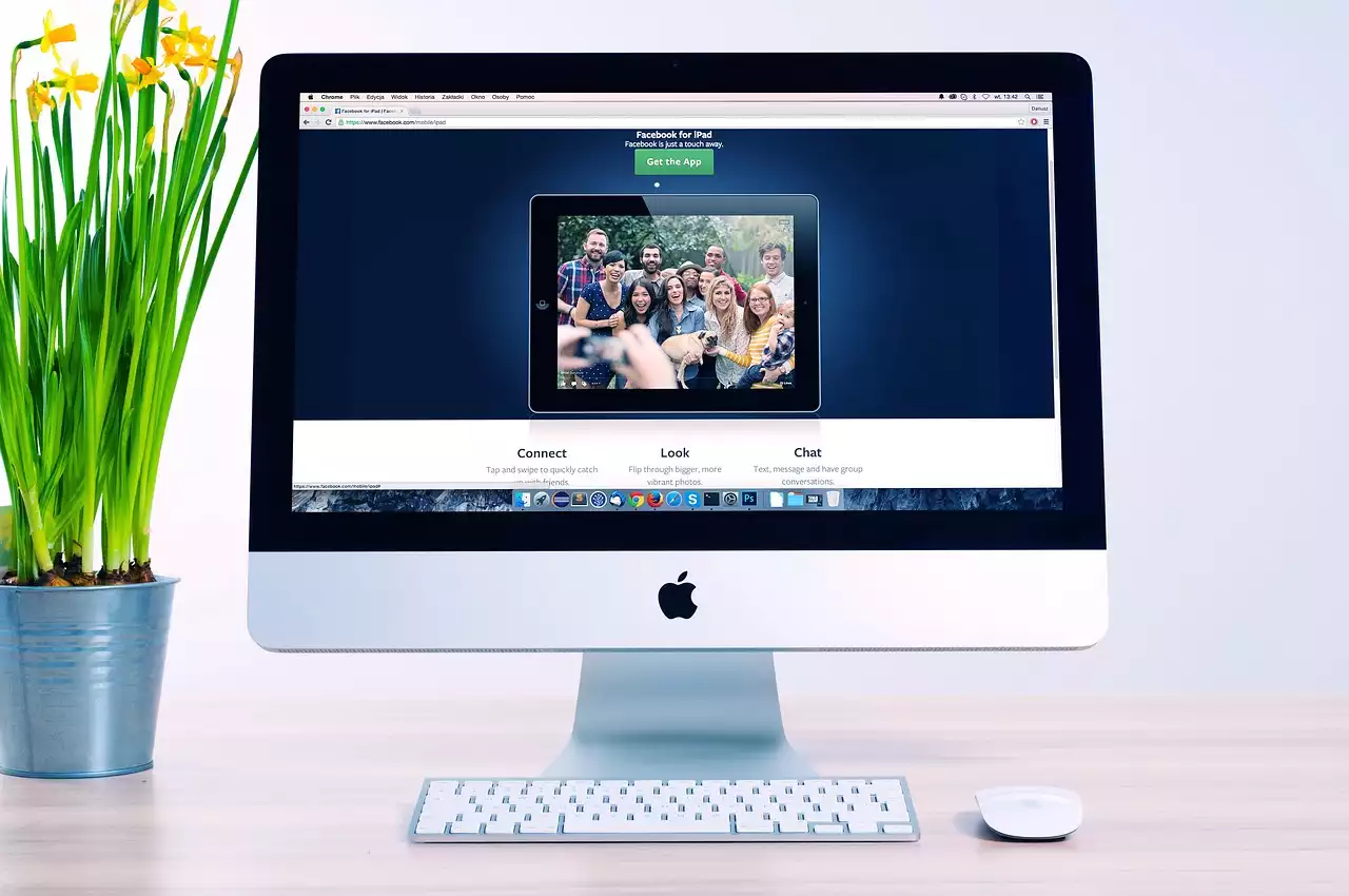
Before we dive into the examples, let's first understand what a landing page is. A landing page is a standalone web page that is designed with a specific goal in mind. It could be to generate leads, sell products, or promote your brand. Unlike a website, a landing page has no menu or navigation bar. The purpose of a landing page is to guide the visitor towards the desired action, such as filling out a form or making a purchase.
Why are landing pages important?
Landing pages are important because they help you achieve your marketing goals. They provide a focused and targeted experience for your visitors, which can lead to higher conversion rates. For example, if you're running a PPC campaign, you want to direct your visitors to a landing page that is relevant to the ad they clicked on. If your landing page is not relevant, visitors are likely to bounce off, resulting in wasted ad spend.
Characteristics of a highly effective landing page
A highly effective landing page has several characteristics that set it apart from an average landing page. Firstly, it has a clear and compelling headline that grabs the visitor's attention. It should communicate the value proposition of your offer in a concise and straightforward manner. Secondly, it should have a visually appealing design that is consistent with your brand. A cluttered or unprofessional design can make visitors lose trust in your brand. Thirdly, it should have a clear call-to-action (CTA) that encourages visitors to take the desired action. The CTA should be prominently displayed and above the fold. Finally, a highly effective landing page should have social proof, such as customer testimonials, that reinforces the value of your offer.
Example 1: HubSpot
HubSpot's landing page for their free CRM software is an excellent example of a highly effective landing page. The page has a clear and compelling headline that communicates the value proposition of their offer - "Organize, track, and nurture your leads and customers with our free CRM". The design is clean and professional, with a prominent CTA button that stands out against the blue background. The CTA is above the fold and encourages visitors to sign up for the free CRM. The page also has social proof in the form of customer testimonials that reinforce the value of the offer.
Example 2: Airbnb
Airbnb's landing page for their Experiences is a great example of a visually appealing landing page. The page has a hero image that showcases the experience on offer and a clear and compelling headline - "Go on experiences designed and led by locals". The design is consistent with Airbnb's brand, with a clean and modern layout. The CTA is prominently displayed and encourages visitors to browse the experiences. The page also has social proof in the form of customer reviews that reinforce the value of the offer.
Example 3: Dropbox
Dropbox's landing page for their business plan is an excellent example of a simple and straightforward landing page. The page has a clear and compelling headline - "The secure file sharing and storage solution built for business". The design is clean and professional, with a simple form that asks for the visitor's email address. The CTA is above the fold and encourages visitors to try Dropbox for Business. The page also has social proof in the form of customer logos that reinforce the value of the offer.
Example 4: Slack
Slack's landing page for their paid plans is an excellent example of a landing page that uses social proof effectively. The page has a clear and compelling headline - "Make work simpler, more pleasant, and more productive". The design is consistent with Slack's brand, with a clean and modern layout. The CTA is prominently displayed and encourages visitors to try Slack for their team. The page also has social proof in the form of customer testimonials and logos that reinforce the value of the offer.
Example 5: Lyft
Lyft's landing page for their ride-hailing service is an excellent example of a landing page that uses a video effectively. The page has a clear and compelling headline - "Ride in style with Lyft". The design is consistent with Lyft's brand, with a fun and colorful layout. The CTA is prominently displayed and encourages visitors to download the app. The page also has a video that showcases the experience of using Lyft, which can help visitors visualize the service and increase their desire to use it.
Example 6: Unbounce
Unbounce's landing page for their landing page builder is an excellent example of a landing page that showcases the benefits of the offer. The page has a clear and compelling headline - "Create custom landing pages with Unbounce". The design is clean and professional, with a simple form that asks for the visitor's email address. The CTA is above the fold and encourages visitors to try Unbounce for free. The page also has social proof in the form of customer testimonials and logos that reinforce the value of the offer.
Example 7: Square
Square's landing page for their payment processing service is an excellent example of a landing page that uses a calculator effectively. The page has a clear and compelling headline - "Process payments anywhere with Square". The design is consistent with Square's brand, with a clean and modern layout. The CTA is prominently displayed and encourages visitors to start processing payments. The page also has a calculator that allows visitors to estimate their monthly processing fees, which can help them make an informed decision about using the service.
Example 8: Wistia
Wistia's landing page for their video hosting service is an excellent example of a landing page that uses a demo effectively. The page has a clear and compelling headline - "Host your videos with Wistia". The design is clean and professional, with a simple form that asks for the visitor's email address. The CTA is above the fold and encourages visitors to try Wistia for free. The page also has a demo that allows visitors to see the features of the service in action, which can help them visualize how it can benefit their business.
Example 9: Crazy Egg
Crazy Egg's landing page for their website optimization tool is an excellent example of a landing page that uses a heatmap effectively. The page has a clear and compelling headline - "Make your website better with Crazy Egg". The design is clean and professional, with a simple form that asks for the visitor's website URL. The CTA is above the fold and encourages visitors to start optimizing their website. The page also has a heatmap that allows visitors to see how users interact with their website, which can help them identify areas for improvement.
Example 10: FreshBooks
FreshBooks' landing page for their accounting software is an excellent example of a landing page that uses a free trial effectively. The page has a clear and compelling headline - "Simplify your accounting with FreshBooks". The design is clean and professional, with a simple form that asks for the visitor's email address. The CTA is above the fold and encourages visitors to start their free trial. The page also has social proof in the form of customer testimonials that reinforce the value of the offer.
What can we learn from these examples?
These examples demonstrate that there is no one-size-fits-all approach to creating a highly effective landing page. However, they do share some common characteristics, such as a clear and compelling headline, a visually appealing design, a clear call-to-action, and social proof. By incorporating these elements into your landing pages, you can create a focused and targeted experience for your visitors that drives conversions and boosts your ROI.


.png?size=50)